How to Build a Landing Page That Actually Converts

Real deal - great landing pages aren't all about pretty pictures. They are about clarity, relevance and getting an individual to do one simple thing. That means removing friction - whether that is signing up, purchasing or booking a call - and making the decision easy.
1. Speak only to your target audience
Start with who are you talking to and what keeps them awake at night. A landing page for gym software is going to differ from one for a skincare brand. Write as if you are talking with a single person - the right person.

Real-world tip: In case you run ads for various groups, tailor the landing page headline for each group. Small tweaks make a difference.
2. Focus on one goal
What is the most wanted action (MWA)? Whether it is collecting emails, giving out a free trial or even pushing direct sales - everything on your page should point to that one thing.
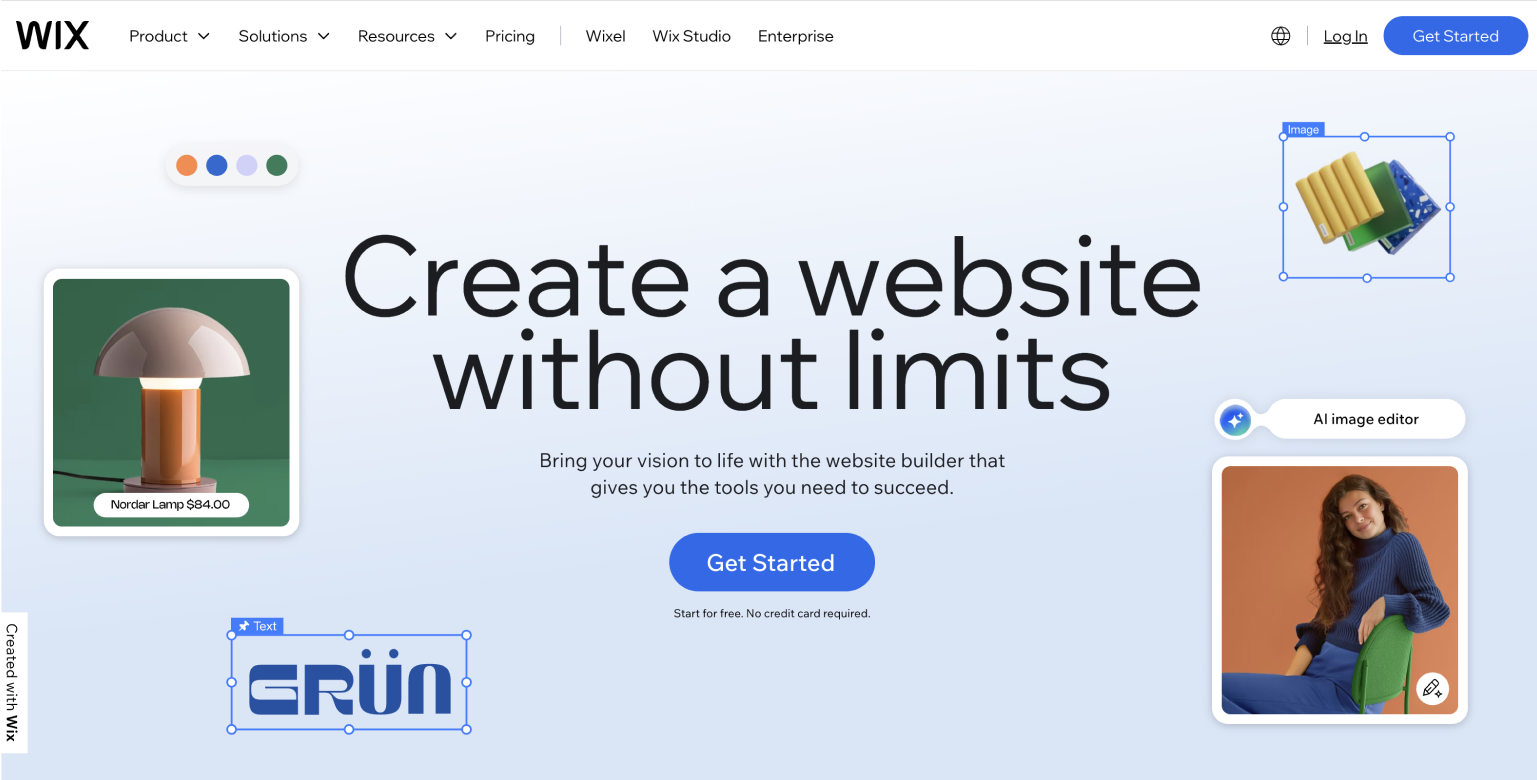
Example: Selling high-end coaching? Ask for an email and not a credit card. Selling socks? Show the cart.
3. Keep your message simple
You know your offer - explain it now. No buzzwords. no fluff. Consider clarity over cleverness. Test different versions - you never know what'll connect.
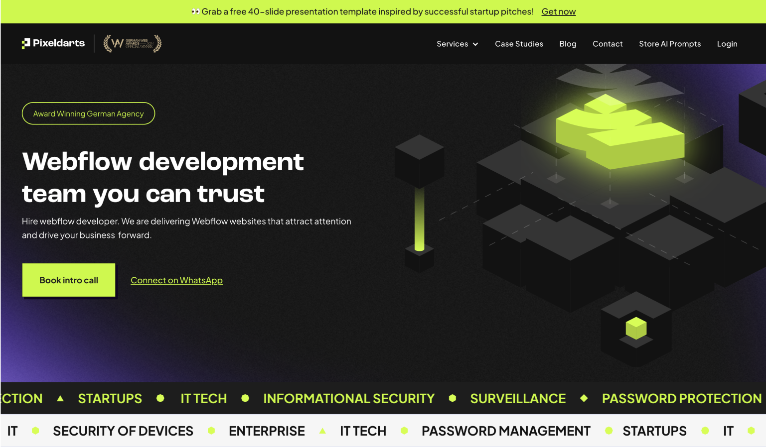
4. Build with intention
Use a headline with a clear CTA button and eliminate anything distracting. Avoid navigation bars and wall of text. Make sure the offer is instantly visible without scrolling.

5. Test and iterate
You will not get it right the very first time around. Test various headlines, button text, page lengths. Track what works and keep improving.
Structure of a High Performance Landing Page
Headline - one clear, huge promise.
Subheadline - make clear or emotional.
Image or hero visual - what it is / the way it can help.
Benefits list - bullets short; easy to scan.
Social proof - reviews, numbers - brands.
Primary CTA - right after they are hooked.
Extra details or FAQ - if required.
Repeat CTA - in footer just in case.
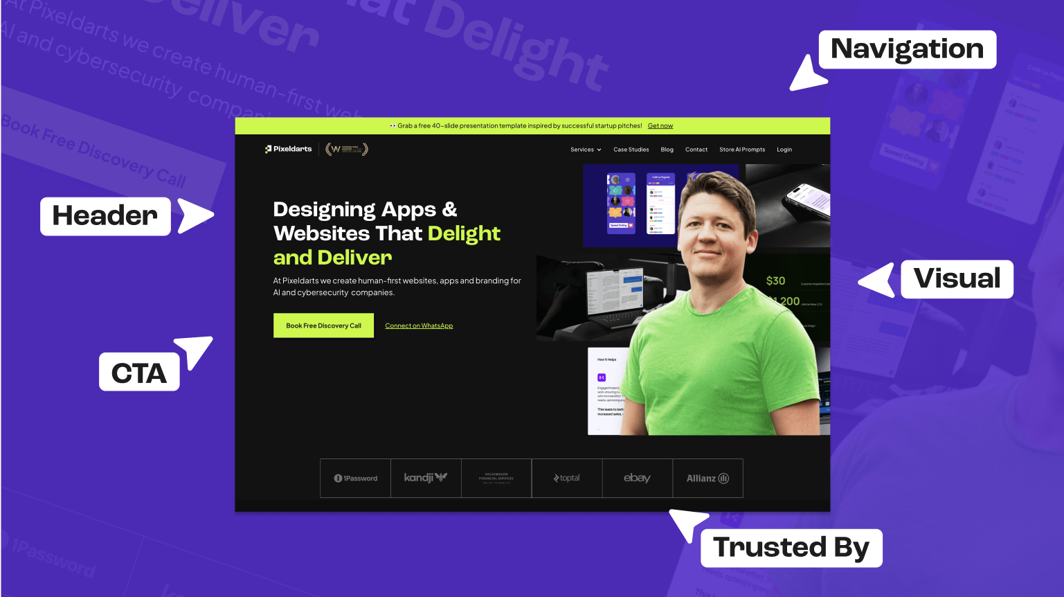
Real-World Examples That Convert
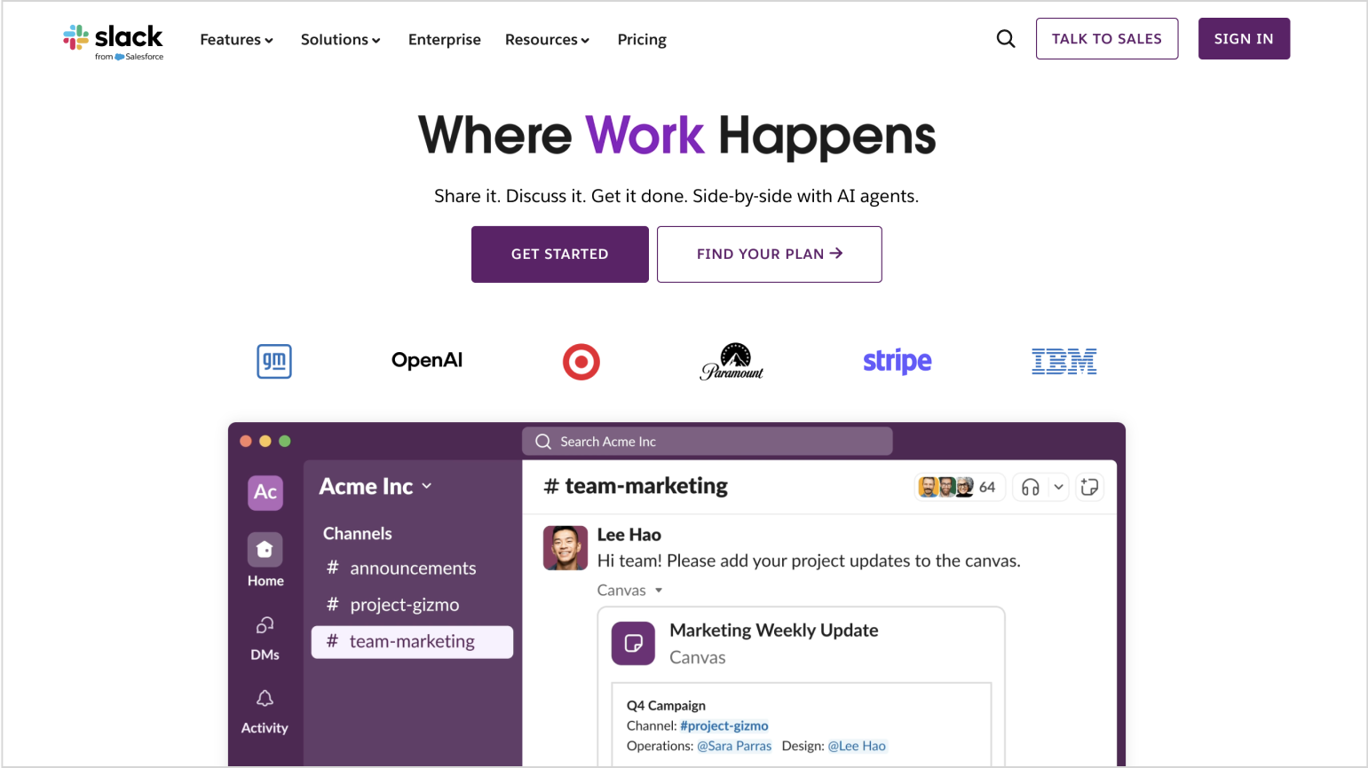
Slack: Clean design, focused value - CTA is always visible.
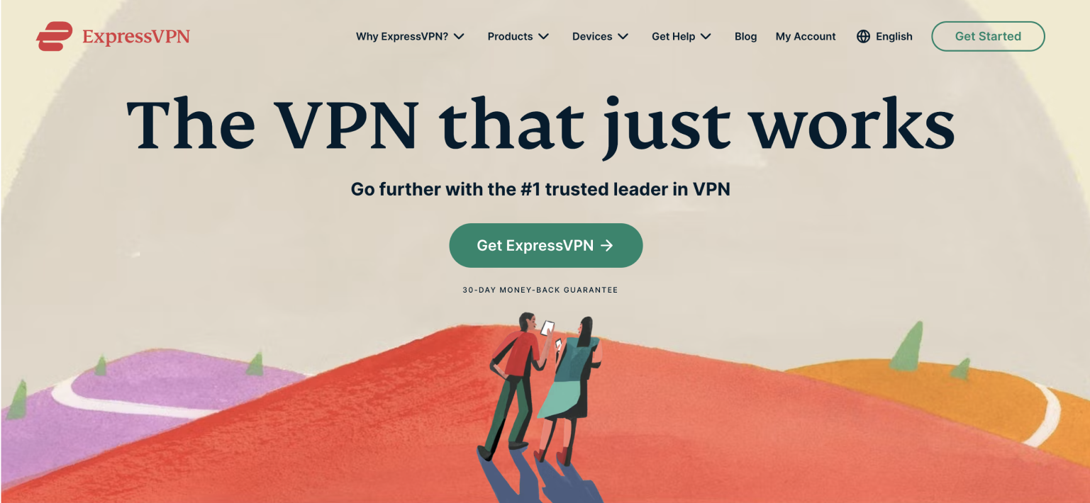
ExpressVPN: Clear promise, urgency, solid CTA.
Webflow: Demonstration immediately, logical scroll, smart proof.

Bonus Pro Tips
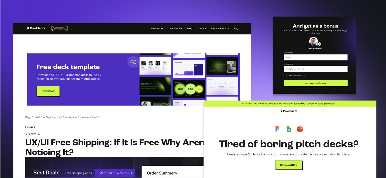
- Add a lead magnet (free guide or checklist) to drive signups.
- Use exit intent popups to capture leaving visitors.
- Keep buttons specific: "Start My Free Trial" > "Submit"
- Make a thank you page a soft upsell or share moment.
In short:
Landing pages are conversations. They are not about shouting at everyone - they are about saying the right thing to someone.
They should feel easy, helpful, and personal.
No confusion. No clutter. Just clarity + actions.


