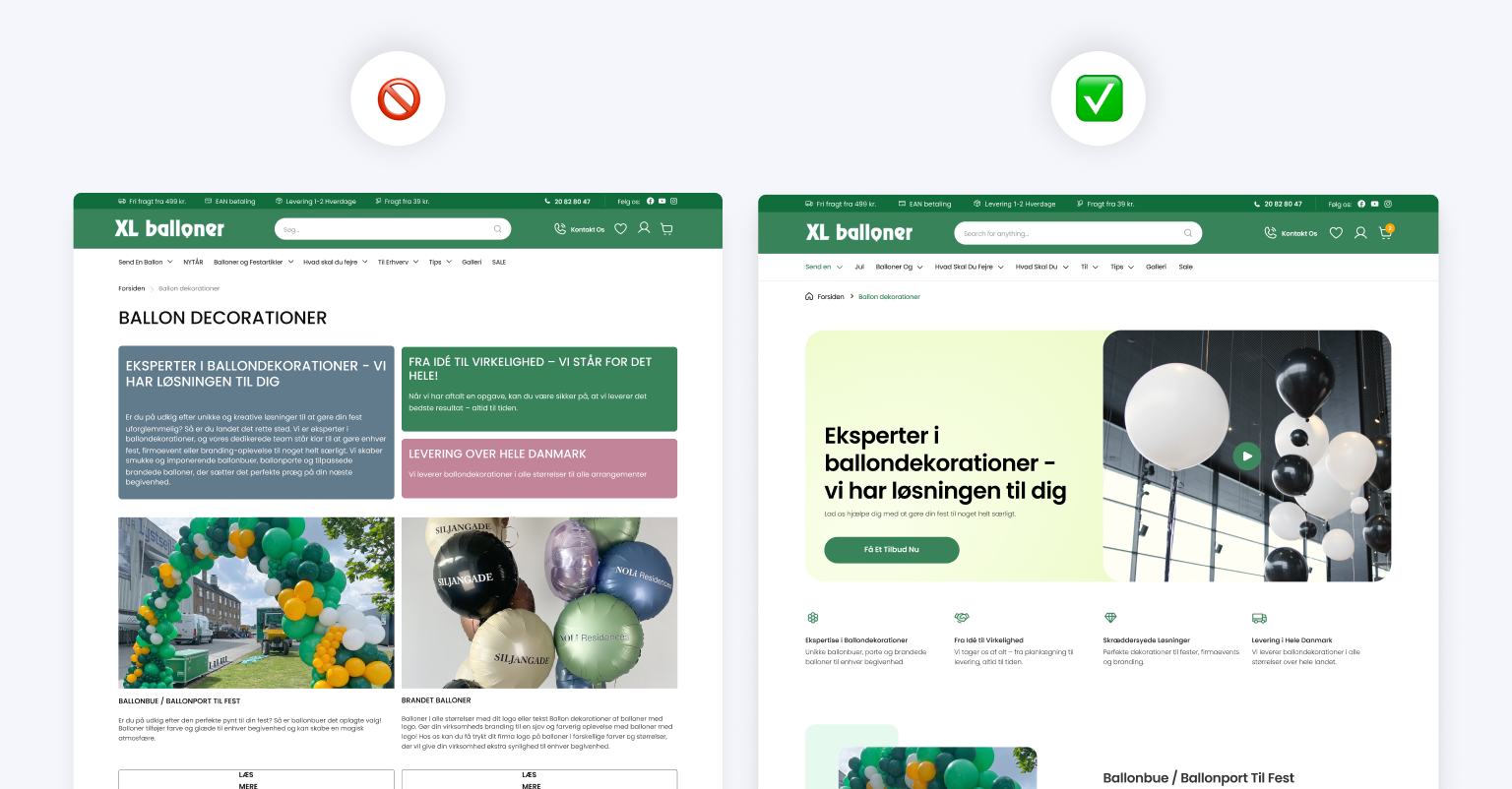
UI Principles for Great Products: Do They Always Work?

Every designer knows the feeling - you design a pretty interface, follow UI principles and hope users love it. But then something happens unexpectedly. Users struggle. They don't click where they should. They become confused.
Just why does this occur? But when good UI principles exist, why do some designs fail? Explore the key principles of great UI design: do they often work in practice?
Visual Hierarchy
You may have seen websites with huge buttons, headlines and banners yelling for attention. They overwhelm you rather than guiding you. Conversely, some websites are too subtle - key actions are buried and users have difficulty completing very simple tasks.

And so where's the balance? A strong visual hierarchy guides the eye naturally. Important elements (like CTAs) must be prominent but not dominate the screen. White space, typography and contrast structure content so it feels simple to navigate. But wait - what if everything seems important?
Sometimes, businesses demand that almost all buttons be bright and all messages be emphasized. The result? Absolutely nothing especially stands out. Good UI is more than making elements visible. It is all about making the correct elements visible at the right moment.
Predictability
Ever go to a site and can not find the search bar or checkout button? When users can not find key features quickly, frustration sets in and conversions drop.

Predictability in UI design doesn't involve making everything appear boring - it entails putting things where people expect them. The shopping cart is normally in the top right corner, the logo frequently links to the homepage, and navigation menus follow common patterns for reasons. These conventions lessen cognitive burden so users can interact with a product.
Simplicity versus Creativity
Take a website like Airbnb. It features a minimalist, intuitive and clean design. So now imagine a site which attempts to resurrect navigation by replacing conventional menus withn't really clever gestures or even layouts. It may look futuristic but will users know what to do?

Creativity in UI is needed but users resist when familiarity is sacrificed for uniqueness. If somebody has to "learn" the way to use your interface, you have lost a bunch of prospective customers now.
But how can we balance? Innovative UI elements can boost engagement if they still feel intuitive and natural.
Consistency
We all have used apps with various buttons, icons and interactions appearing on different pages. It is frustrating. Users want consistency - they don't want to earn how to interact with your product on the fly.
But here is a question: Is strict consistency always great?

Take an e-commerce platform. Product browsing could be colorful and image-heavy but checkout is simpler, more ordered and free of distractions. The UI changes somewhat but in a manner that makes the experience better than confusing users.
The takeaway? Consistency matters but not at the price of adaptability. Different sections of a product might require different design methods with a common brand identity.
Adaptability
A site which looks fantastic on a big desktop screen could be an unreadable puzzle on a mobile device. Today's users switch between cell phones, tablets, and desktop computers seamlessly and expect the same smooth experience everywhere.
Adaptability is much more than resizing elements - it is about maintaining clarity and usability across all display sizes. Buttons should be tappable, text readable and navigation user friendly whether with a touchscreen or a computer mouse.

In conclusion
Following UI best practices can create excellent digital experiences but applying them blindly does not guarantee success. Real-life design is messy: users don't always behave as expected, business needs change and innovation at times demands breaking the rules.


