Four design principles behind Stripe, Linear, and Vercel
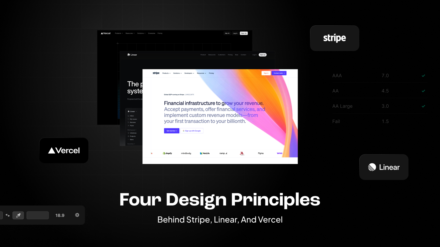
TLDR Summary: Three things that are in common for three big and successful brands: Stripe, Linear, and Vercel. Their branding has high contrast, smart usage of white space, and they use a monochrome color foundation.
1. High contrast
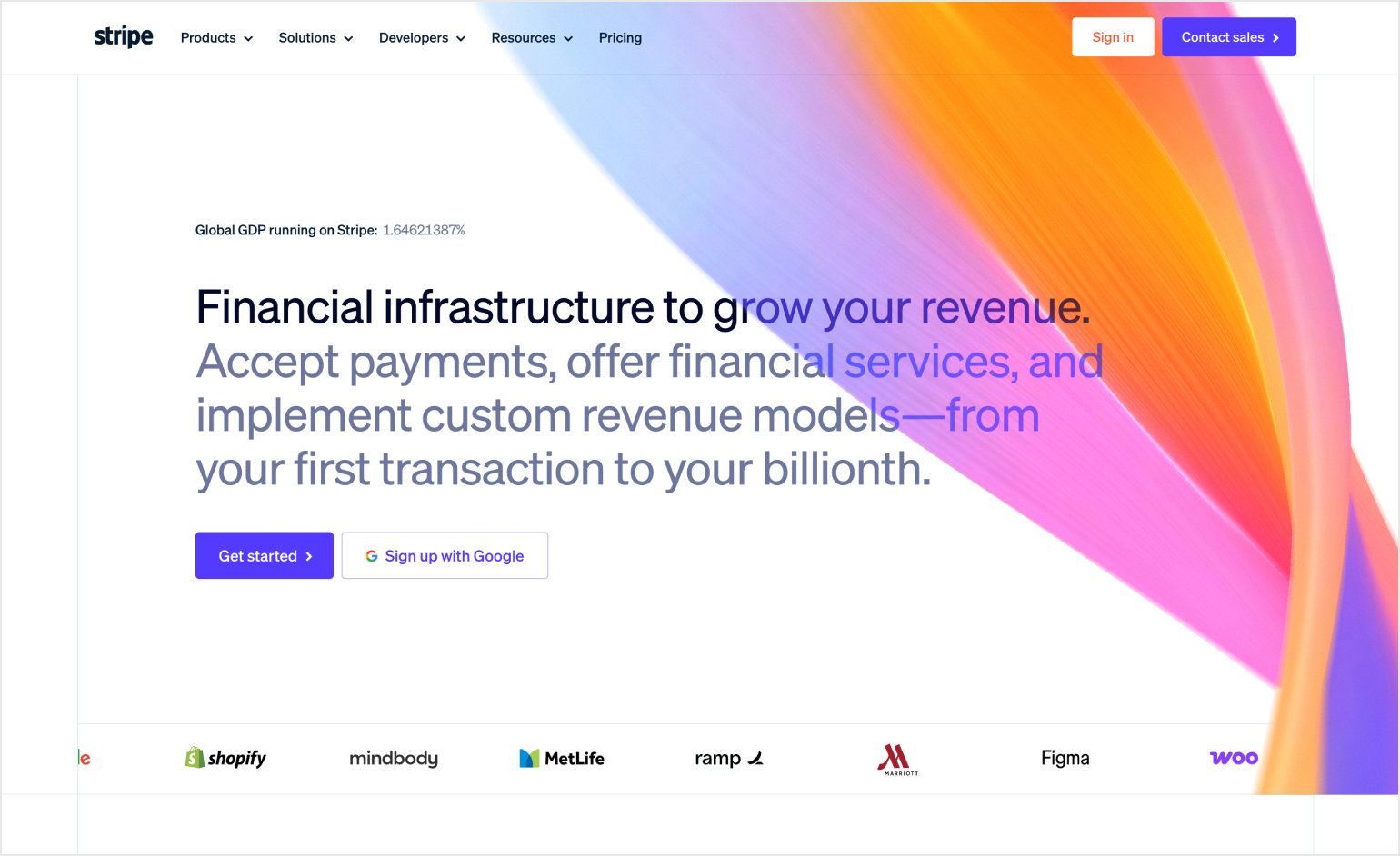
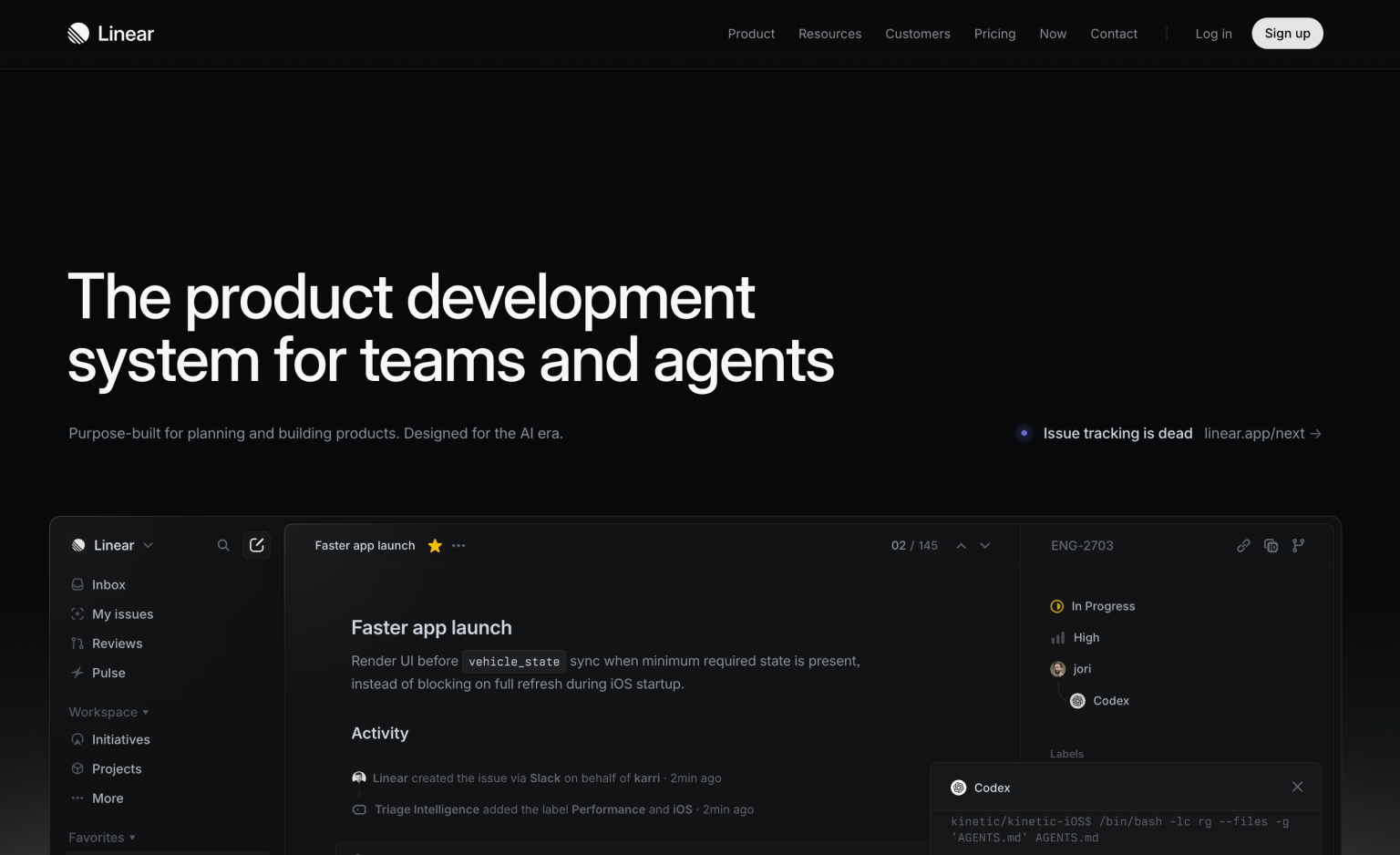
They are all having aggressively high contrast. Black on white, white on black, nothing muddy in between. When you land on any of these sites, your eye knows exactly where to go. Most brands are afraid of this. It feels harsh, too stark. These three leaned into it, and that's a huge part of why they feel so sharp.

2. Generous whitespace
Elements are spaced out from each other. There's always more space than you'd think is necessary, and that's the point.
Whitespace is not emptiness, it's air. When elements aren't crowding each other, the eye relaxes and knows where to go. Dense layouts make eyes work hard, open ones let the content do the job.
A simple rule: take the spacing that feels like enough, then double it. That's probably where it should have been from the start.
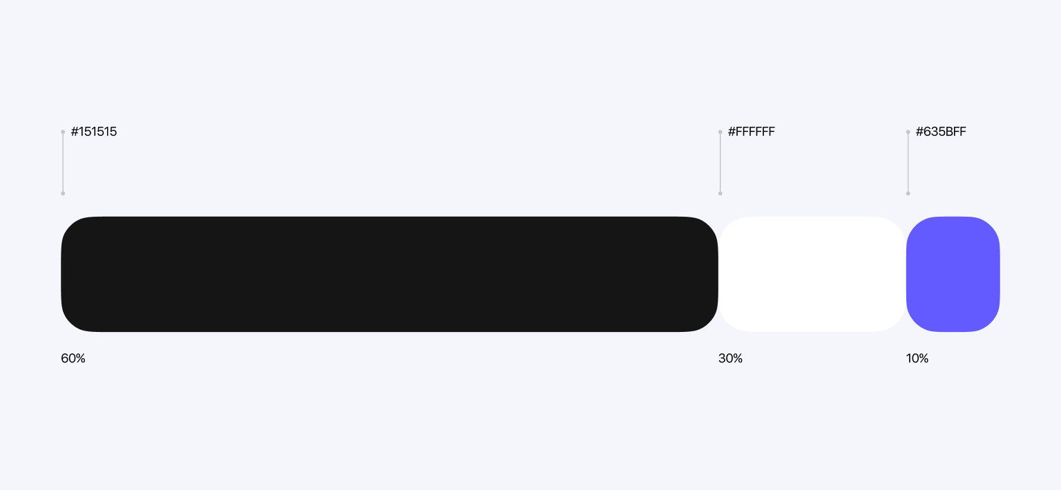
3. Monochrome base with one accent
Their palette is almost entirely black, white, and gray. Then one color does all the work: Stripe's gradient, Linear's purple, Vercel's pure white-on-black with rare blue touches. One color used sparingly hits harder than five colors used everywhere. It's the same principle as the Hermès orange.
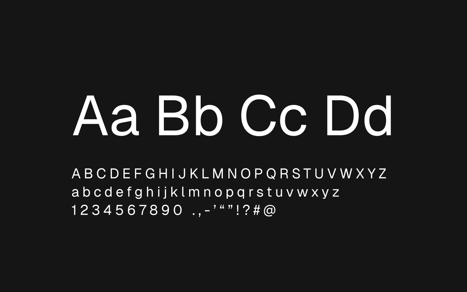
4. Sharp typography
No rounded, friendly, approachable fonts. Everything is tight, geometric, slightly cold. The type communicates "we are an infrastructure product built by engineers who care about craft" without saying a single word about it. That's the real reason these brands feel so coherent. Every screen, every touchpoint runs on the same rules.
Why this combination works
These aren't four separate decisions. They reinforce each other. High contrast needs whitespace to not feel aggressive. Monochrome needs sharp type to not feel boring.
Take one element out and the whole thing gets slightly worse. Put them all together and you get something that feels inevitable, like it couldn't have been designed any other way.
That's the hardest thing to pull off in design. Not beautiful. Not clever. Inevitable.
Which one nails it best
Stripe gets the most credit and probably deserves it. They set the template and the gradient became a cultural moment in itself. And again and again and again they dictate design to other mainstream SaaS applications.
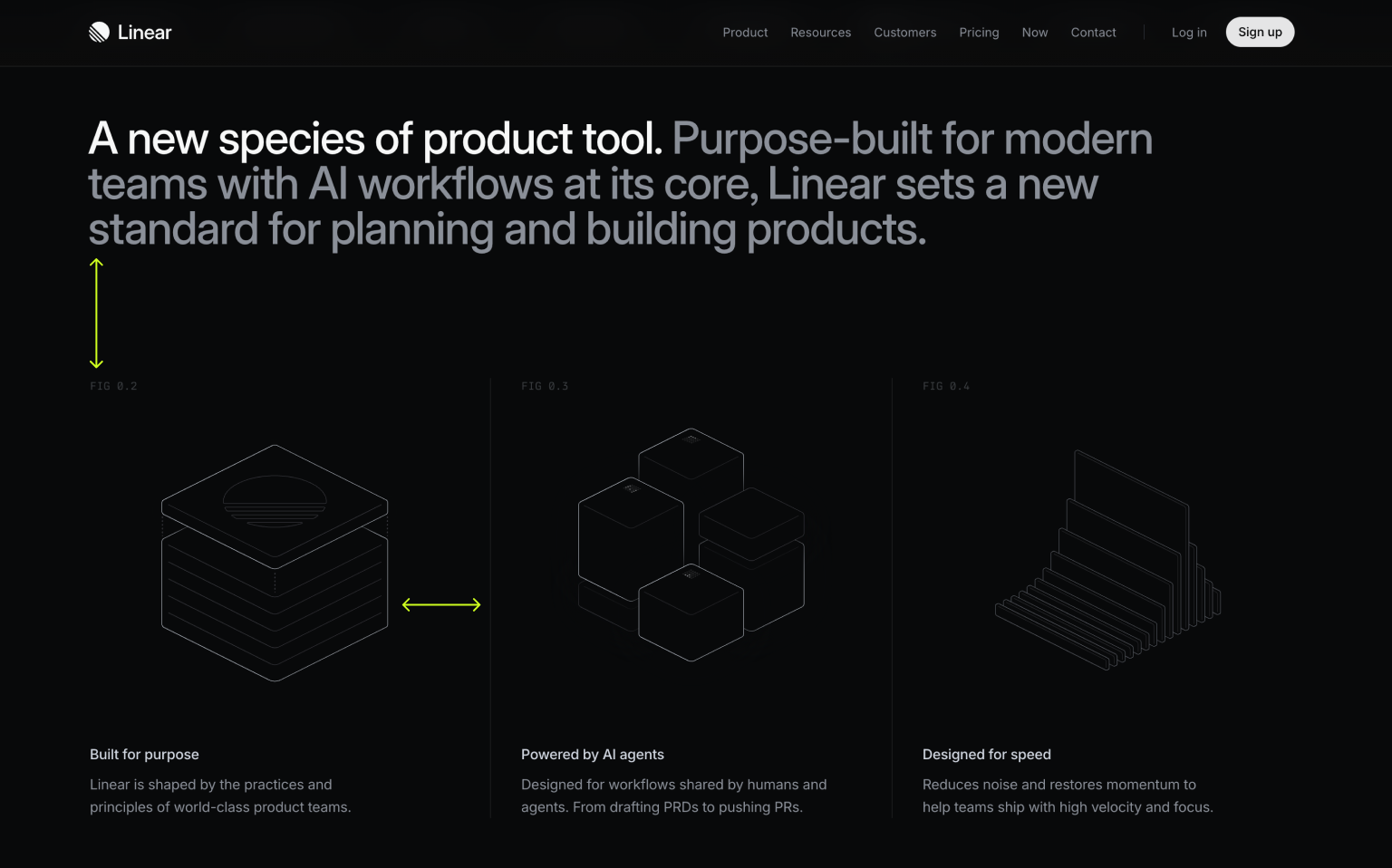
But Linear is the most consistent execution of this system. Every screen, every interaction, every piece of copy feels like the same person made all of it with the same principles. Nothing is off. Nothing feels like a different team touched it on a different day.
Vercel is close, but it's the most utilitarian of the three. Less "designed" and more "engineered to look designed," which is a compliment, but a smaller one. Linear wins. Not loudly, but clearly.

Final Thoughts
These rules now so well understood that it's becoming the default for any B2B SaaS that wants to look serious. In a few years it'll be the new "blue for trust," a signal that reads as serious but says nothing specific about who you actually are. This mirrors a broader shift already happening in the industry. The brands that figure out what comes after this will be the interesting ones to watch.
For now, high contrast, whitespace, monochrome plus one accent, sharp type still works and still wins.
If you're building for SaaS or developer tools and want work that looks this intentional, see what we've built.