


How to choose a color palette for a logo. A guide.
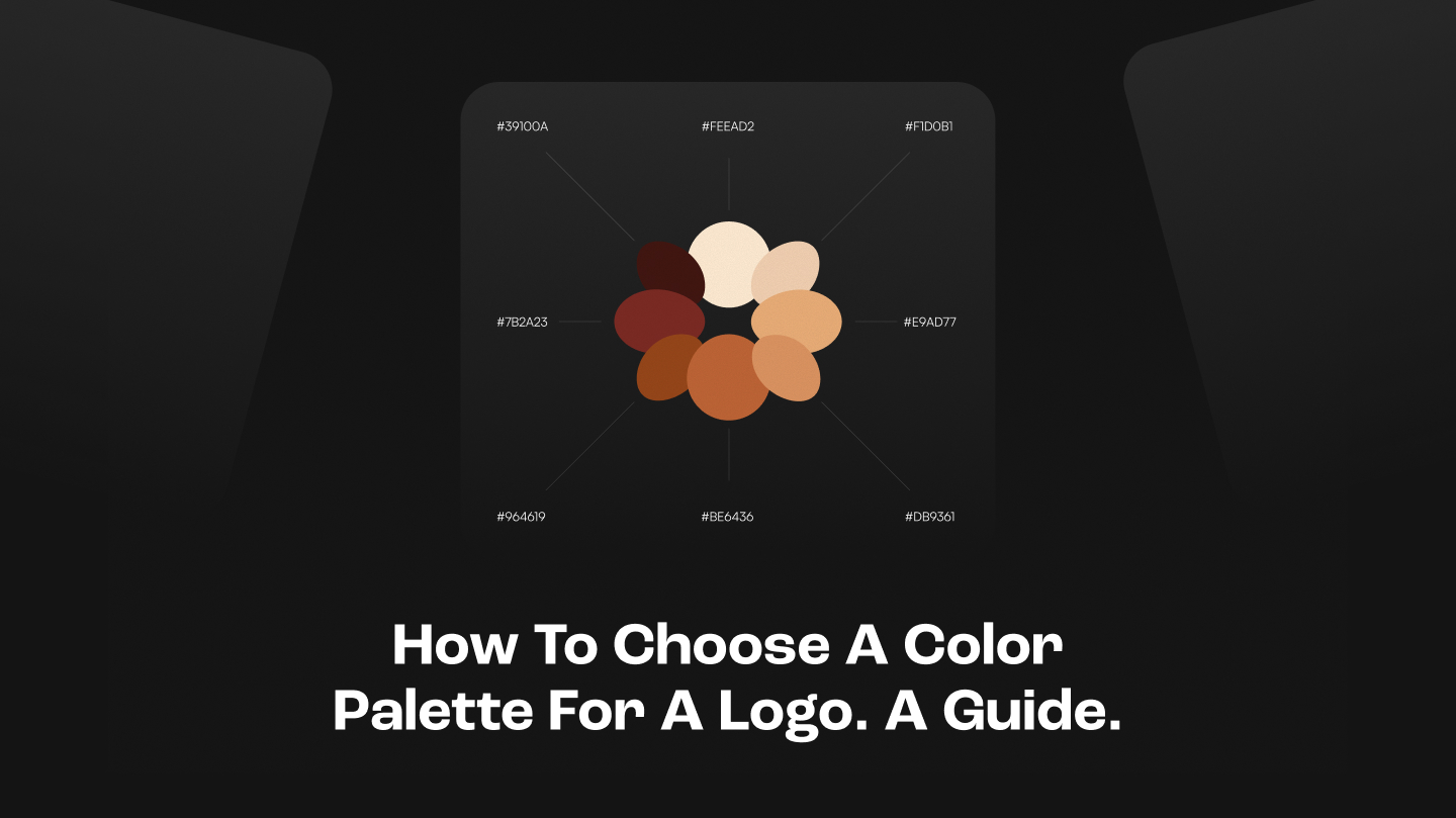
TLDR Summary: Brands spend thousands on logo redesigns and end up with the same feeling as before. The problem was never the shape. Before you've read a word, color has already made the premium-or-cheap call.
How the color of the same logo could change the perception of it
Same mark, same font, same tagline. Saturated blue on white looks like a startup that never quite made it. The exact same mark on black with a thin gold outline suddenly belongs in a hotel lobby. Nothing changed except the palette.
Cheap color is predictable color: blue for trust, green for health, red for energy. As easy as it gets.When you pick a color because it fits the category, you've made your branding is invisible. But if you're rethinking your brand identity from the ground up, here's how we approach it.
Let's look at the two examples below. Which one feels more exclusive and rich?

Brand colors of these companies are their unique visual identity point
And some companies that are smart about color and branding made their colors trademarks and you cannot imagine the brand without this color anymore. This is very good for recognition
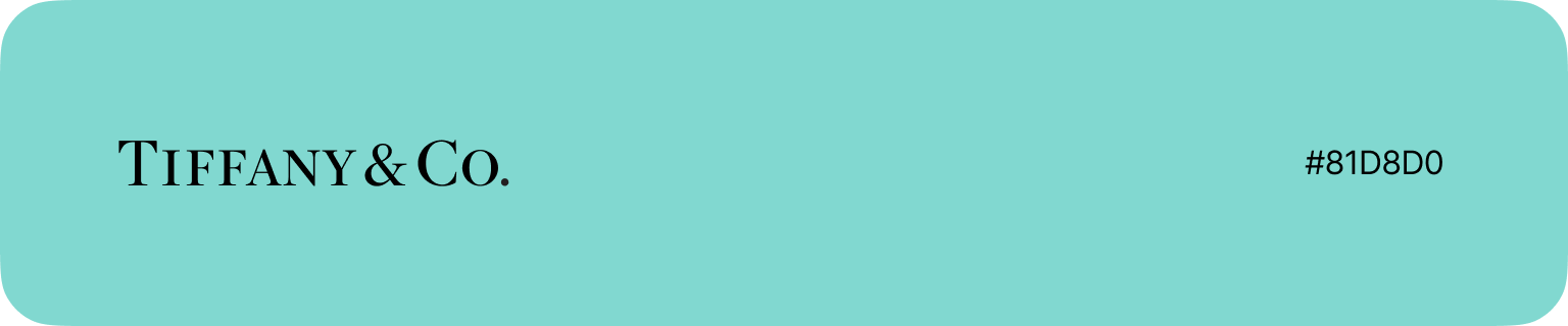
Tiffany turned a robin egg blue into a registered trademark. The box creates desire before it's even opened.
Hermès landed on their orange by accident - wartime cardboard shortage, they used what was available. They kept it. Now it's one of the most recognized objects in luxury globally.

Cadbury chose purple as a nod to Queen Victoria, then defended it in court against Nestlé for years. Worth every penny.

Coca-Cola has owned red since 1886. Not just any red - a specific warm, slightly orange-leaning red that became inseparable from the product itself. Competitors tried red too. None of them stuck because Coca-Cola got there first and never left.

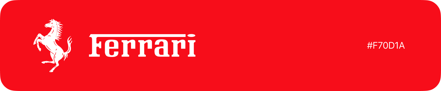
Ferrari red started as a racing regulation - Italian cars competed in red at the Grand Prix in the early 1900s. The rule disappeared. The color stayed. Now it doesn't say "Italian racing car." It says Ferrari specifically, and nothing else.
UPS chose brown in 1916 because it was practical - brown hides dirt on delivery trucks. A logistics company accidentally built one of the most recognizable brand colors in the world out of a maintenance decision. They even ran a campaign asking "What can Brown do for you?" - leaning fully into a color most brands would have run from.

None of these came from a brief. They were chosen, then protected, then repeated until the color and the brand became the same thing. If you want to go deeper on how cultural context shapes visual identity, this McDonald's case study is worth reading.
Why do most brands suck with colors
The most important thing is consistency. Hermès orange works because it's been orange for 80 years. That's it. That's the whole secret.
And other companies build palettes with seven colors and stand for none of them. They refresh every two years and wonder why nothing sticks. They never legally protect anything.

The most ownable brand color
Picking a brand color is not about finding the most beautiful hue. It is about finding one nobody in your category is using, and holding it long enough that it stops being a color choice and starts being a brand asset.
Look at your competitors. Map out what they own. The gap you find is your opportunity.The hard part is not picking the color. It is keeping it. Most brands quietly drift - a slightly different shade here, a refreshed palette after a rebrand, a designer who wanted to try something new. Five years of that and you own nothing.
How to actually choose yours
How to choose the brand color for a company? We made a breakdown for you.
Step 1: Map what your category already owns
Which colors are not being used in your industry? Before you pick anything, audit your direct competitors and list their primary colors. You are looking for the gap, the color nobody in your space has claimed. If every fintech startup runs dark navy and electric blue and you walk in with a warm terracotta, you own the room by default.T-Mobile chose magenta precisely because no other major telecom had touched it. The color became a competitive asset before it became a brand asset. Coca-Cola didn't choose red to be exciting. They held it long enough that red in fast food became theirs.The question is never "what color do I like." It is "what color can I own."

Step 2: Match the color to your positioning, but not your taste
Every color has its own meaning and energy or vibe. You can say this will have a big impact on your brand perception.
Warm colors (red, orange, yellow) communicate energy, appetite, and warmth. They work in consumer contexts: food, retail, entertainment. At high saturation they read as mass-market. Muted and dark, they shift toward luxury and craft.

Cool colors (blue, green, purple) communicate calm, trust, and restraint. Blue is overused in B2B for this reason. Spotify's green is an exception worth studying: neon-adjacent, digital-native, energetic. It doesn't read as eco or organic at all. They chose a specific green that belongs in dark UI and then held it.

Black and white are underrated as a primary palette strategy. Notion runs on almost no color. The restraint communicates focus and seriousness, and it ages better than any trend color.

Aubergine (Slack's specific purple-brown) is a lesson in unexpected choices. Slack's shade is muted and warm, which made it feel different from both the playful blues of consumer apps and the cold grays of enterprise software. A tool that felt like it was built by people who thought about it.
Color psychology is about the color in context: what surrounds it, what it is applied to, and what associations your audience brings to it.

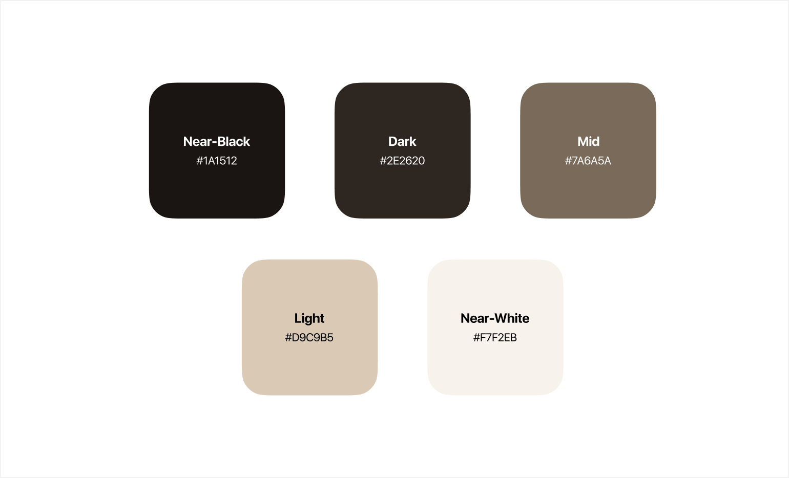
Step 3: Build your neutrals with intention
Neutral colors carry most of the work in real-world applications. Body text, backgrounds, borders, UI chrome. Getting them wrong kills a palette that looks great in a swatch.
Warm neutrals (slightly beige whites, brown-tinted grays) pair with warm anchor colors. Cool neutrals (blue-tinted whites and grays) pair with blues, greens, and purples. Mixing warm and cool unintentionally creates visual tension most people can't name but everyone feels.
Always avoid pure black (#000000) for text. A very dark neutral around #111111 reads as black but sits more comfortably. Build at least five steps in your neutral scale: near-black, dark, mid, light, near-white. You will use all of them. A solid design system documents these values from day one.
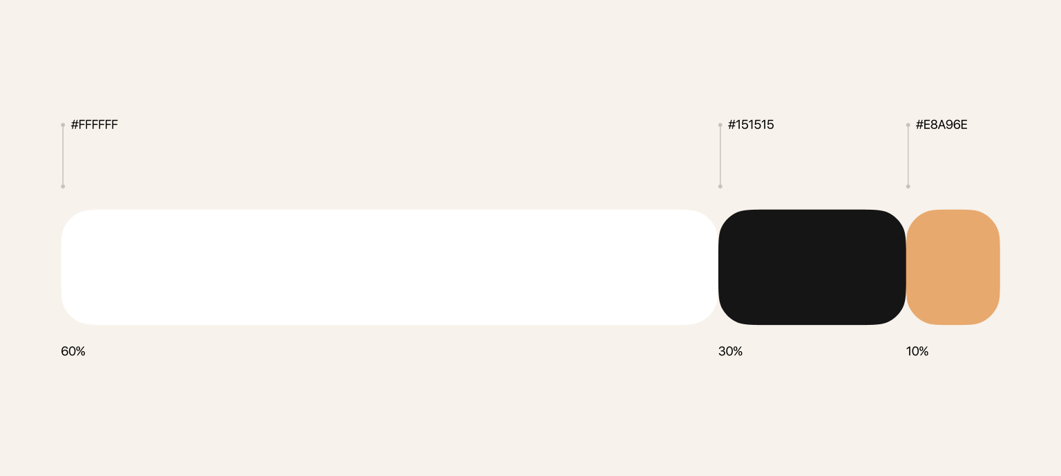
Step 4: Apply the 60-30-10 rule
60% is your dominant color, almost always a neutral. Backgrounds, large surfaces, white space. 30% is your secondary. 10% is your accent, the anchor color.
The mistake most brands make is using their anchor color at 60%. That is what creates the overwhelming, cheap feeling. Spotify uses green as a 10% color against dark backgrounds. That is why it feels energetic without feeling loud.
If your brand identity feels inconsistent or exhausting, check the proportions before anything else.
Step 5: Test before you commit
A palette that looks good in a swatch grid tells you almost nothing. You need to see it working.Put your anchor color on white, on your darkest neutral, and on your lightest neutral. Test at small sizes: a 24px icon is a different test than a 400px logo. Run every foreground-background pair through a contrast checker. WCAG AA requires a minimum ratio of 4.5:1 for normal text. A palette that fails contrast needs to change.


Convert everything to grayscale. If your colors collapse into the same gray value, you don't have enough contrast in the palette structure. Then test on real layouts: a webpage, a business card, a social post. If it only works in one context, you will hit problems the moment the brand expands.


Common mistakes
Make sure you don't fall into these common mistakes when creating color for branding.
Too many colors. If your brand has eight colors "plus neutrals," you don't have a palette. You have a box of crayons. Every color should earn its place.
Trend choices. Pantone's Color of the Year is designed for fashion editorial. Trend-based color choices age fast. Tiffany chose their blue in 1845. That is the timeframe you should be thinking in.
Not protecting anything. If someone sees content from your brand without the logo, can they identify it? If the answer is no, your color is not doing its job.
Color before strategy. Color should come out of positioning, not personal preference. What you want to own in your category, how you want to be perceived, who you are talking to: these questions come first. Color is the answer, not the starting point.
Quick checklist before you finalize.
Anchor color: does it differentiate you from direct competitors? Can you own it in your category? Does it match your positioning, not just your taste?
Neutrals: do warm and cool temperatures align throughout? Have you built at least five steps in the scale?Proportions:is your anchor functioning as a 10% accent rather than a 60% base? Is there a clear visual hierarchy?
Technical: does the palette hold across white, dark, and mid-tone backgrounds? Does it survive grayscale? Do all text combinations pass WCAG AA contrast?
Strategy: does someone already own this color in your space? Is this a durable choice or a trend? Would your color identify your brand without the logo?
If your brand looks cheap, don't redesign the logo. Open the palette file at first.
Or better yet, start with a brand and design audit and work through it properly.


