


Science behind successful SaaS landing pages. I analyzed 50 of them

TLDR Summary: Every landing page follows the same 7-section structure. Hero, social proof, problem, features, demo, testimonials, CTA. It works because it mirrors how buyers make decisions. Everyone copied it, and now it is table stakes.
The catch is that when every page looks identical, the structure stops doing work. Generic copy inside a generic layout makes you invisible. One unexpected moment in any section is all it takes to make the whole page stick.
Use the skeleton. Then make sure each section actually says something.
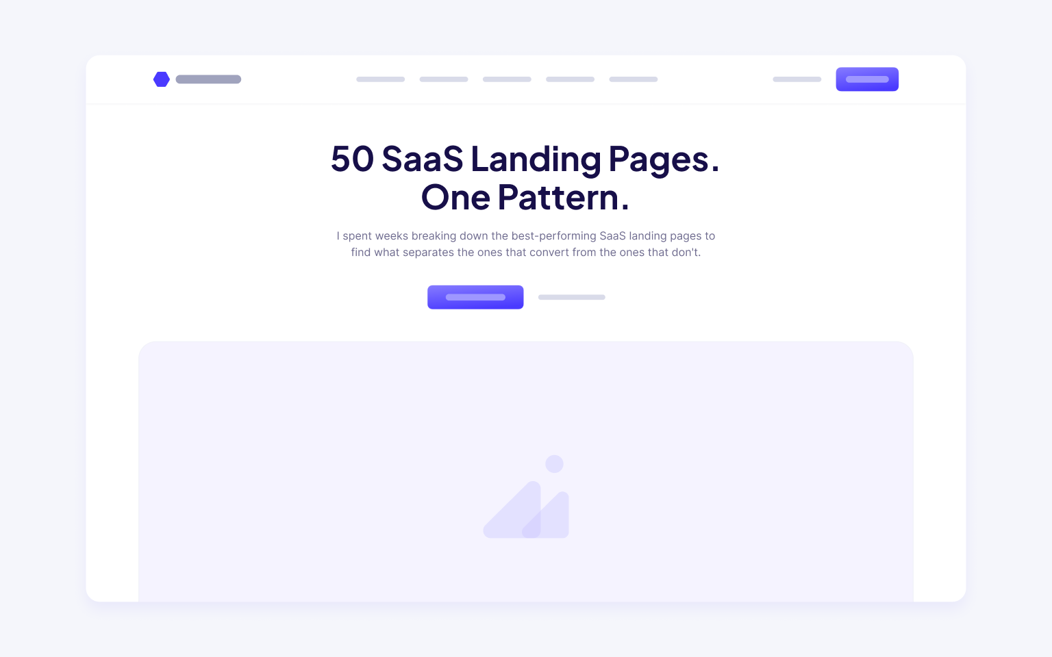
1. Hero. Big claim, one CTA
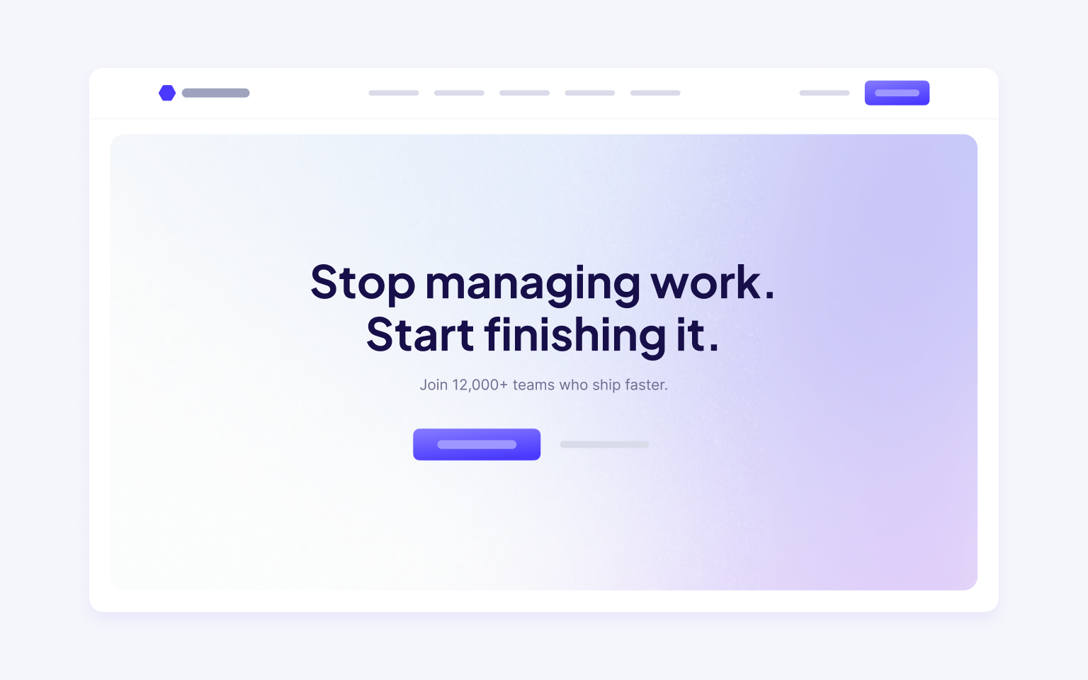
A headline promising transformation, a subline with one sentence of context, a button. Sometimes a product screenshot underneath.
2. Social proof strip
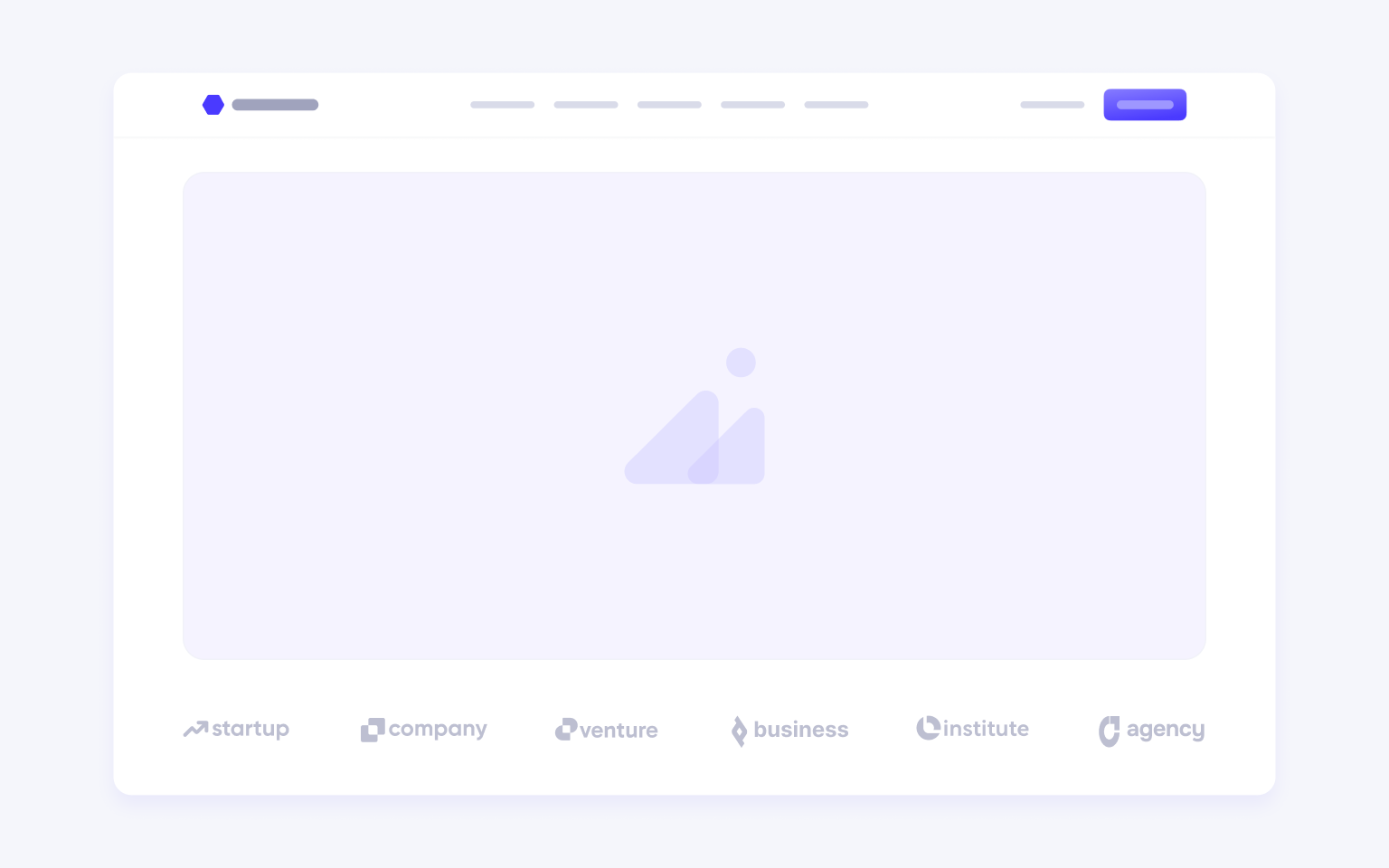
Logos from recognizable companies. No quotes, no names. The message: someone you've heard of trusted us. It shows up within the first scroll on nearly every page.
3. Problem, or "the old way."
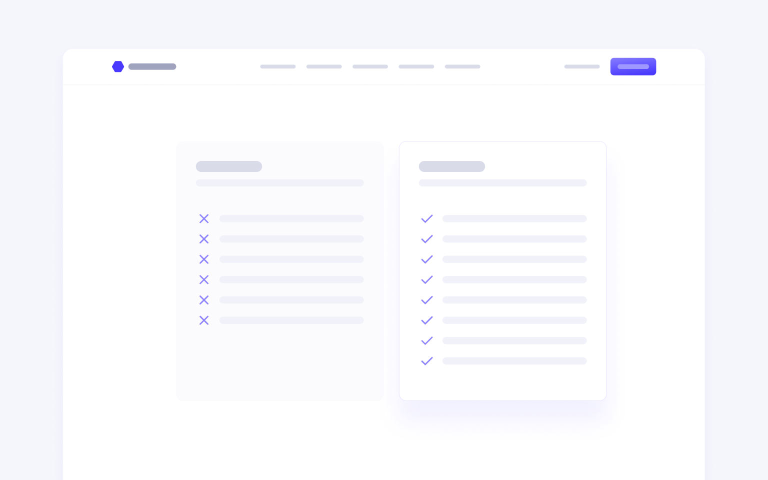
A short paragraph about what's broken in the current workflow, or a before-and-after. It sets up the product as the obvious next step.
4. Feature breakdown
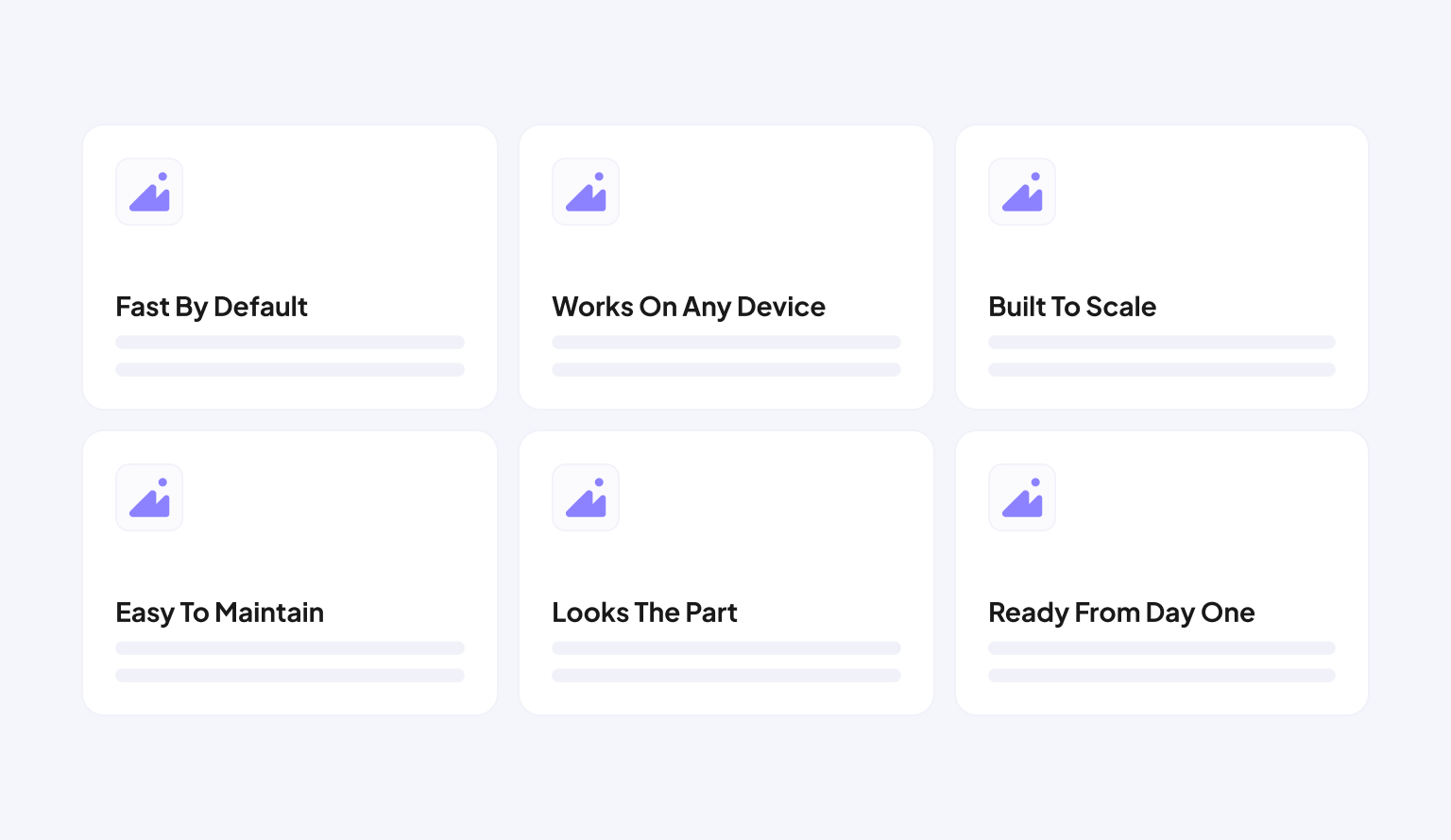
Three columns, sometimes four. Icon, short title, one sentence, repeated across the full width. The layout varies almost not at all.
5. Product in depth
A larger screenshot or demo, usually alternating, image left and text right, then text left and image right. Sometimes a video. This is where the page actually shows the thing.

6. Testimonials
Real quotes with faces and job titles. Usually three in a row, usually from someone at a company you recognize, saying the product saved them hours every week.

7. Final CTA
A repeat of the hero. Big headline, button, sometimes a note about a free trial or no credit card required. The page ends the same way it started.
If you're building a SaaS landing page, this is the skeleton you're working inside.
Why they're all identical
Because it works. Not because designers are lazy, but because this sequence maps almost perfectly onto how a skeptical buyer moves through a decision. First you get grabbed. Then you see that others trusted it. Then you understand the problem being solved. Then features. Then proof it does what it claims. Then social validation. Then a push.
Someone figured this out, it converted well, others copied it, and now it's table stakes. For anyone designing in the B2B SaaS space, this structure is the baseline assumption, not a creative choice.
The catch
When every page uses the same structure, the structure stops doing work. Visitors stop reading and start scanning for the one thing that separates this product from the last three they looked at. If your copy is generic on top of the generic structure, you're invisible.
The formula is not the problem. Lazy execution inside the formula is. The best pages, as covered in how to build a landing page that actually converts, use this exact skeleton and then do something unexpected with at least one section. A hero that's brutally specific. A testimonial section that's actually funny. A pricing table that's weirdly honest. One moment that breaks the pattern just enough to make the whole page stick.
What to do with this
Use the 7 sections. Put them in order. Then go back through every single one and ask whether it actually says something or just fills the space.
Most landing pages fail not because the structure is wrong but because the people who built them confused having a framework with having a message. The skeleton is free. Everyone has it. The only thing that's actually yours is what you put inside it.
See how that looks in practice across the products we've designed.


