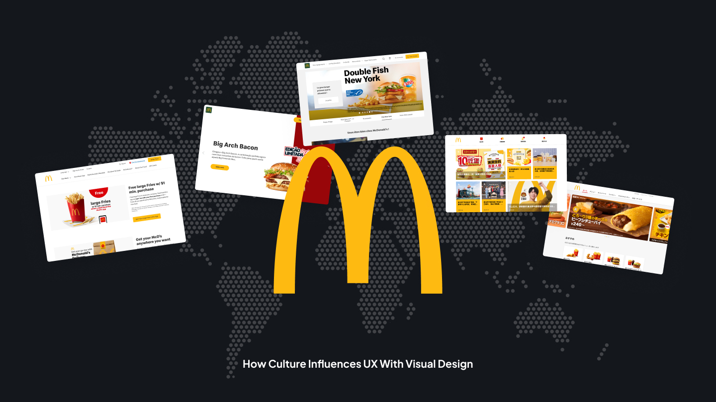
How Culture Influences UX with Visual Design: McDonald's Case Study.
TLDR Summary: McDonald's uses the same brand but adapts UX and visual design to regional cultures: Asia favours dense, mobile first, promotion heavy interfaces; the U.S. prioritizes bold visuals and quick conversion ; Europe offers a lot more restrained layouts, structure and trust-building simplicity. Colors switch meaning - red for urgency or celebration, yellow for attention, greener for sustainability - and motion and layout reflect just how different cultures scan, decide and interact - suggesting that great global design is all about cultural fit, not visual uniformity.
Introduction
Worldwide brands speak about consistency - identical logo, same colors, same tone. But when you look carefully at interface design, particularly at scale, consistency becomes flexible. McDonald's is a good example: just about the most well known brands in the world, however, its digital interfaces feel oddly different in every nation.
Precisely why is the U.S. version loud and sales driven but Japan is structured and information dense? Precisely why does China embrace visual overload and France focus on function and clarity? Using McDonald's sites as a living design system in motion, this report investigates how culture influences UX decisions, color perception, layout density and interaction patterns.
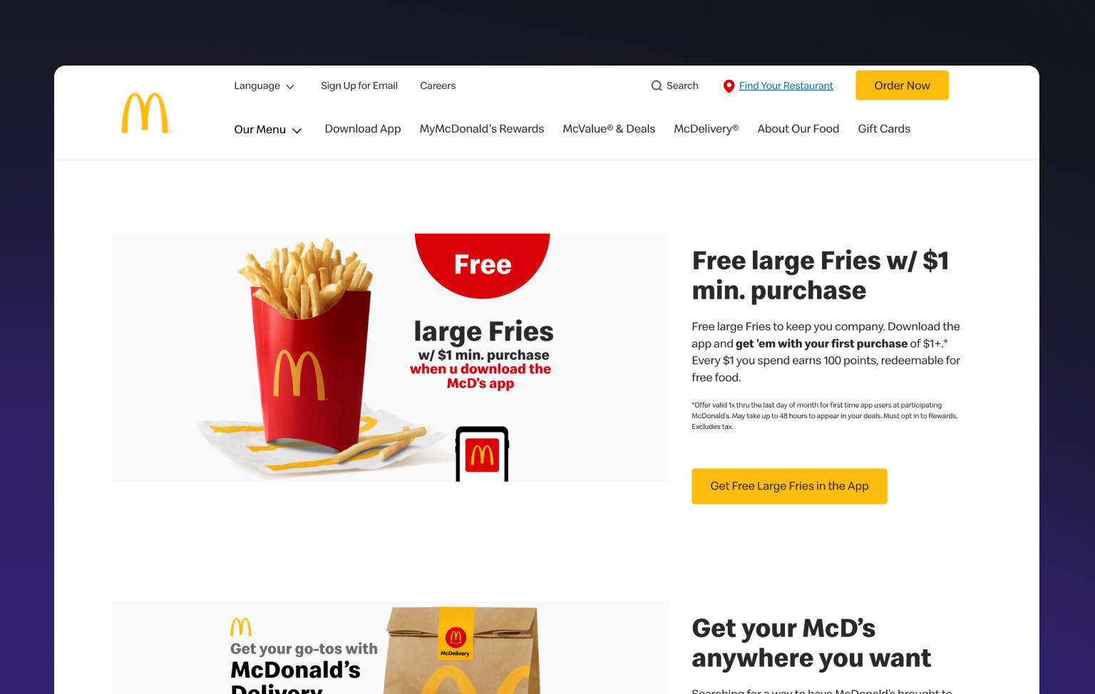
United States - Speed, Emotion & Conversion First UX
The U.S. interface is action-oriented and promotion-heavy. Large product pictures dominate the viewport, frequent CTAs ("Order Now," "Get the App") and white / yellow branding is unabashedly loud.
Visit the website: https://www.mcdonalds.com/us/en-us.html
- Strong visual hierarchy around conversion.
- Huge imagery with emotional food photography.
- There's minimal informational depth on the homepage.
- Red for appetite and urgency.
American digital culture focuses on speed, lucidity and decisiveness. Users expect quick paths to action and are comfortable with aggressive marketing. Red here signifies energy and instant - not danger - but motivation.
Japan - Order & Visual Discipline
Japan's McDonald's site just feels different. The interface is structured, content rich and segmented. Seasonal products, collaborations and limited editions are organized in grid like systems.
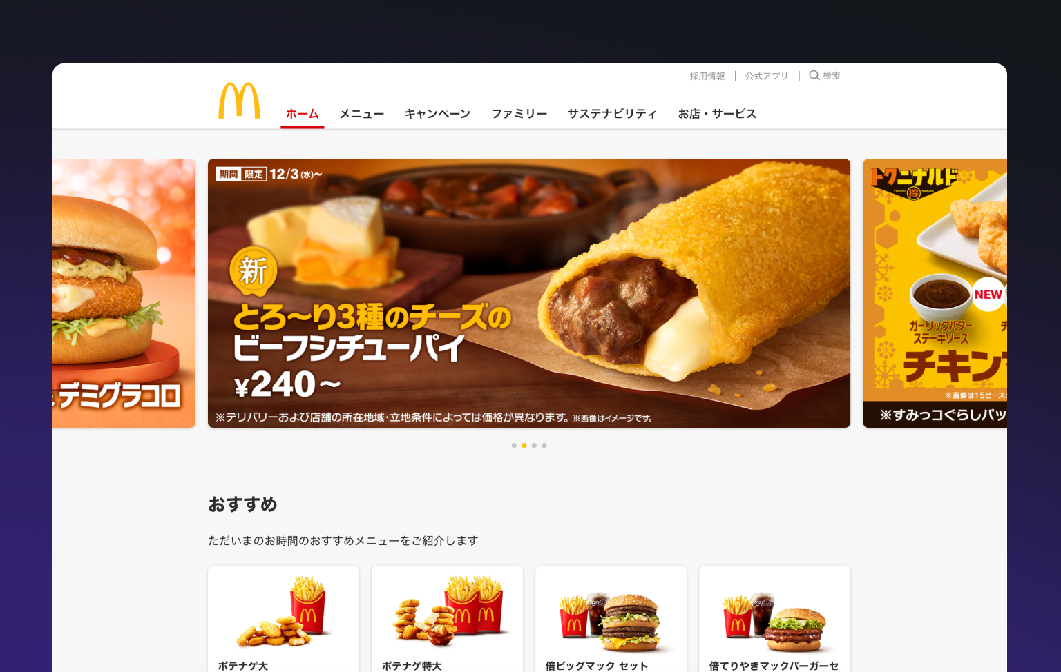
Visit the website: https://www.mcdonalds.co.jp/
- High information density with clear segmentation.
- Smaller imagery, more text and labels.
- Controlled color usage, less emotional contrast.
- Special attention to seasonal updates and precision.
Japanese users are used to processing large amounts of information and value clarity over minimalism. The design reflects cultural requirements for order, predictability and detail respect. Here yellow serves as a structural tool to help users scan complicated pages. It isn't emotional or playful - it's organizational.
China - Mobile First, High Stimulation, Ecosystem UX
China's interface was built for mobile behaviour and ecosystem thinking. The site is visually dense, banner-heavy and full of promotions that prompt fast decision-making and integrates with local platforms.
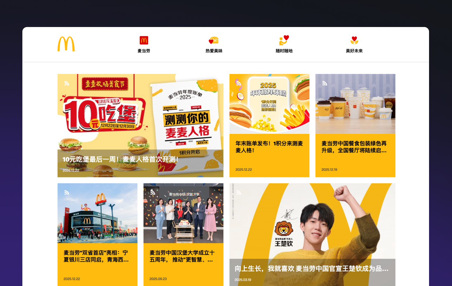
Visit the website: https://www.mcdonalds.com.cn/
- Dense layouts with stacked promotional banners.
- Strong contrast along with colors.
- Shortcuts to coupons, delivery and campaigns.
- UX built for speed in a super app mindset.
Chinese users are used to rapid scanning and visual saturation. Red here signifies good fortune, prosperity and celebration - not appetite. The interface embodies a culture of transactional, quick and connected digital experiences.
France - Editorial Tone, Aesthetic Restraint
France brings a turn toward storytelling and visual refinement. The interface is calmer, there's more white space, typography and less aggressive CTA placement.
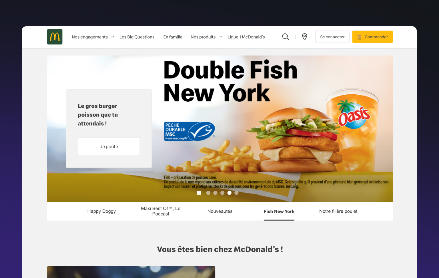
Visit the website: https://www.mcdonalds.fr/
- Layouts which are editorial style.
- Softer color contrasts.
- Focus on quality & sourcing.
- Less visual pressure to convert immediately.
French design culture is about flavor, aesthetics and narrative. Fast food still must be considered, gastronomically appropriate. In Europe, users are sensitive to ecological and ethical cues. Green helps reposition McDonald’s from “fast food” to a more conscious, modern brand.
Portugal - Simple & Familiarity
Portugal's interface is quieter and more restrained than in the U.S. The layout focuses on clarity, familiar navigation and approachable visuals.
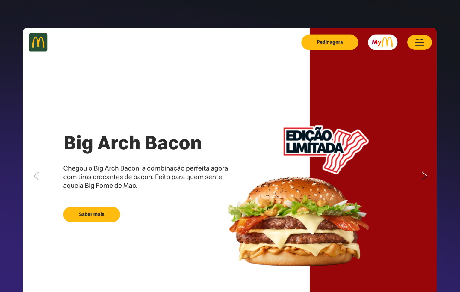
Visit the website: https://www.mcdonalds.pt/
- Balanced layouts without visual overload.
- Usage of brand colors moderately.
- Familiar, predictable navigation patterns.
Southern European users place comfort and clarity above innovation in daily digital products. The interface is friendly rather than persuasive - a place you know.
Color as UX Strategy Not Brand Decoration
A general pattern emerges across regions:
Red - action, urgency, stimulation.
Yellow - navigation, friendliness, brand recall.
Green - trust, balance, responsibilities.
Their hierarchy changes culturally however.Europe makes green credible. Japan uses yellow as structure. U.S. keeps green functional & secondary. Same palette - different priorities.
What These Differences Tell Designers
Many patterns emerge across these markets:
Color is cultural not universal. Red creates urgency in the U.S., celebration in China and must be softened in Japan and Europe.
Minimalism is relative. What's clean in France might be empty in China - and overwhelming in Japan - if not structured.
UX reflects behavior not trends. High information density operates where users expect it. Wherever trust and familiarity matter even more, simplicity works.
Closing Thought
McDonald's does much more than translate language - they translate visual psychology. Yellow can advise, green can reassure, red can excite - but only when utilized in culturally familiar ways.
The lesson for designers is simple but powerful :color is better when it acts as users expect it to.
Portugal's McDonald's web site utilizes motion and interaction extensively in Europe. Unlike the stoic static layout of France, the Portuguese interface is alive with animated transitions, hover effects, shifting components in addition to playful micro-interactions.