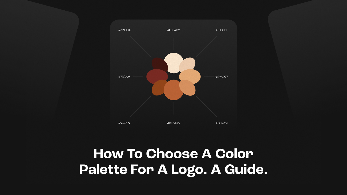
How to choose a color palette for a logo. A guide.
Brands spend thousands on logo redesigns and end up with the same feeling as before. The problem was never the shape. Before you've read a word, color has already made the premium-or-cheap call.


Our team of expert designers and devs can
handle it and ship within 4 to 8 weeks.