


Every AI logo is one of 3 shapes. How to choose one for your AI app
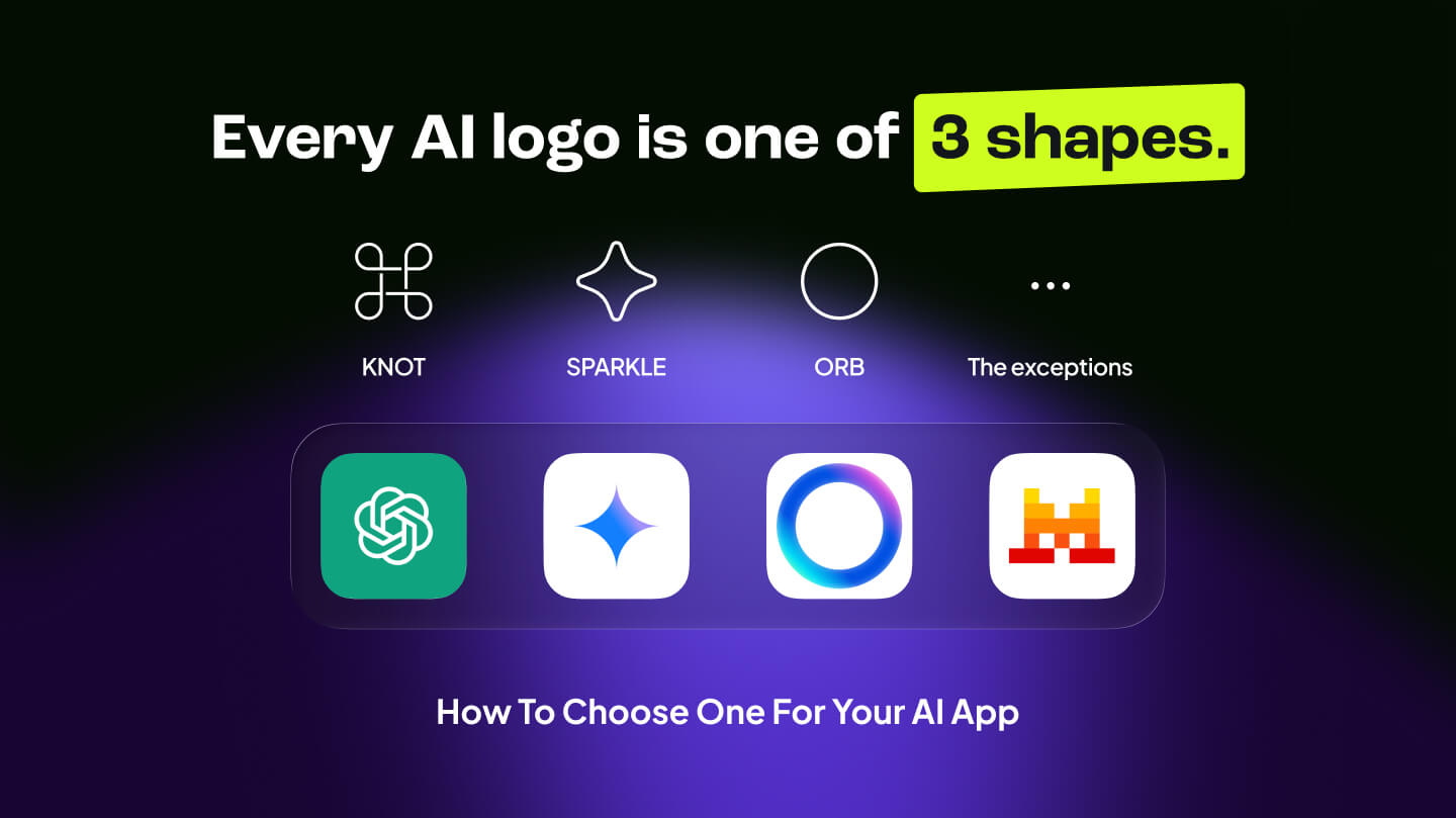
TLDR Summary: Knot, sparkle, or orb: 15 AI brands, 3 shapes. Why AI logos all look the same, which brands broke the rule, and how to brand an AI product without disappearing into the category.
Every AI logo is one of three shapes. Once you see it, you cannot unsee it.
I put 15 AI fresh brands next to each other to see the difference. Instead I got three columns that sort themselves. So the real question became: are companies being lazy, or is something else going on?
So far AI logos exist in 3 shapes
The Knot.
A loop, a weave, a hexagonal braid. OpenAI's interlocking mark is the template, and Perplexity follows the same logic. The message it delivers - "we are complex, but connected." It is the shape of a system you are supposed to trust without understanding.
.png)
The Sparkle.
The four-point star. Gemini uses it, Claude's burst belongs to the same family, and then there is the :sparkles: magic button in every app you touch: Gmail, Notion, Canva, Adobe, Slack. As far as I can trace it back, Google was already using a sparkle for automatic photo enhancements a decade ago. Generative AI turned it into the universal sign for "AI lives here."
.png)
The Orb.
A glowing gradient circle. Meta AI's ring, Siri's new glow, ChatGPT's voice mode. Very generic, mysterious and ambiguous on purpose. An orb does not explain anything. It says "magic, don't ask how."
.png)
Most of them come in black, or in a gradient. Rarely anything in between. Ten years ago it was blue wordmarks.
This is not the first time a whole category dressed the same.
In the 2010s every startup had a geometric sans-serif wordmark, usually in blue. Around 2017 every crypto project had a hexagon or a coin. Now every AI company has a knot, a sparkle, or an orb. Different decade, same reflex.
Lazy, or something else?
1. Category before brand. When a category is new, a logo has to say "this is an AI product" and label it. They work like the coin shape worked for crypto: instant sorting for a buyer who does not yet know the players.
2. The app icon constraint. Most AI brands live as a 16 to 64 pixel icon in a sidebar, a browser tab, a phone screen. Only simple geometric marks survive that. A detailed illustration does not.
3. Risk. Investors, enterprise buyers, and app store browsers all pattern-match. Looking like the category is safer than looking different, especially when your product changes every three months and your logo is the one stable thing.
There is one more twist. The sparkle stopped being a logo and became a UI convention. It is the new hamburger menu: an icon that means a function, not a brand. Which makes it a strange choice for a brand mark. You are borrowing a symbol that every competitor's interface also uses.
Luckily, there are exceptions
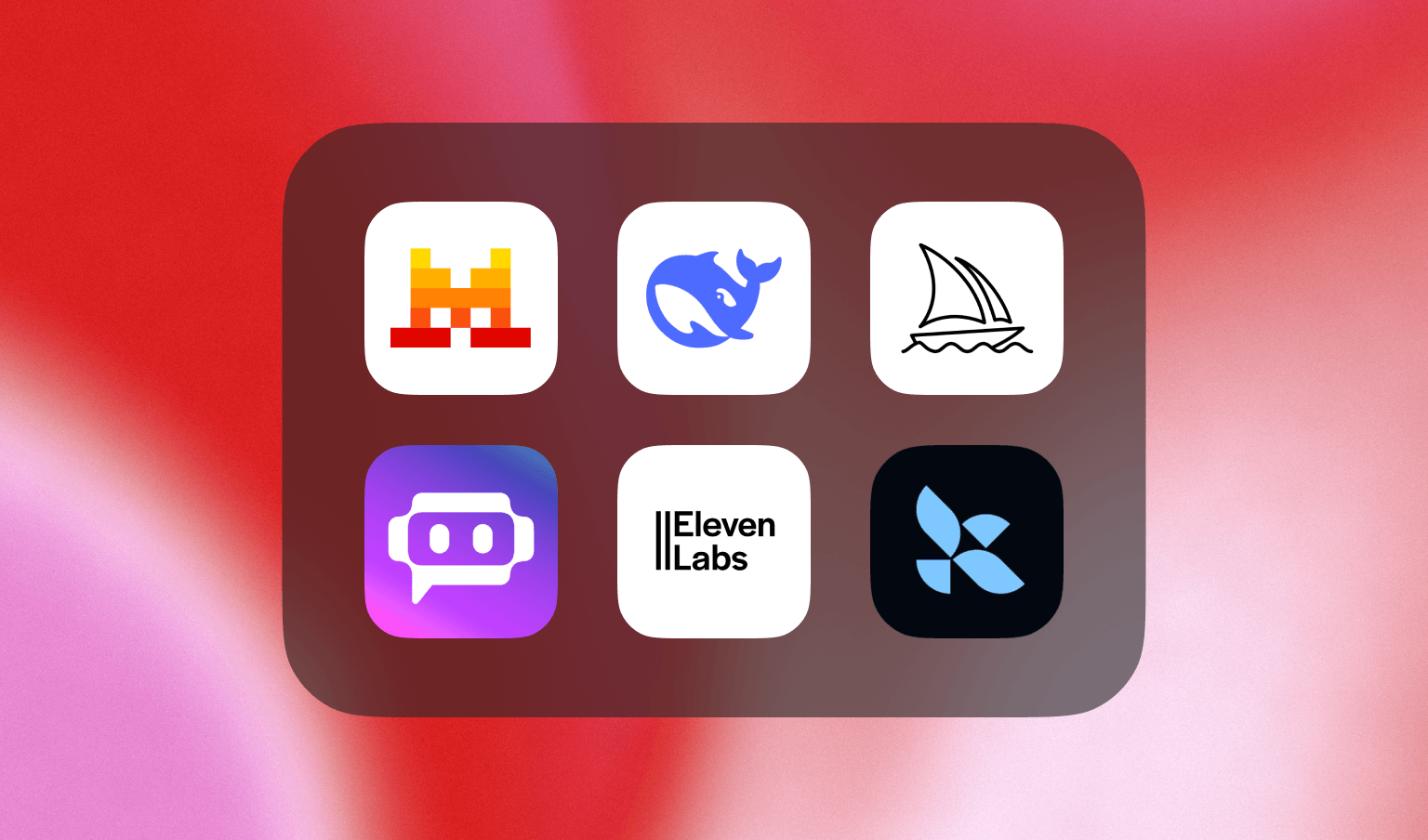
Mistral's pixel M. DeepSeek's whale. Midjourney's sailboat.
They stand out precisely because they broke the rule. A pixel-art letter says "we are engineers with humor." A whale says "big and calm." A sailboat says "exploration" and looks nothing like a knot. None of them needed a gradient to feel like AI. And none of them are harder to recognize at 32 pixels ...
If you are branding an AI product
1. Decide how much category you need. If you sell to enterprises who have never heard of you, borrow one category code so they sort you correctly. If you sell to developers or consumers who already know what AI is, borrow none. One code maximum, never two.
2. Do not make the sparkle your logo. It already belongs to the interface. Your brand cannot own it, and inside your own product it will collide with your own AI buttons.
3. Start from a noun, not a shape. A whale, a boat, a pixel, a letter. Shapes sort into columns. Things get remembered. Ask what your product would be if it were an object, and draw that.
4. Design at 16 pixels first. Sketch the app icon before the full mark, not after. If the idea dies at favicon size, it dies. Only then scale it up to the wordmark and the launch page.
5. Run the grid test. Drop your draft into the three-column grid above. If it sorts cleanly into Knot, Sparkle, or Orb, you are not done. Iterate until it needs a column of its own. This one test catches more generic logos than any brand workshop.
And a note on color: black and gradient are the category's defaults. Owning a single flat color, the way Mistral owns orange, is the cheapest distinctiveness available.
Building an AI product and don't want to look like the other fourteen? Talk to us - contact@pixeldarts.com or book a free discovery call.


